Showing posts with label Teaching Tips. Show all posts

Sunday 10 August 2014

Is your teaching website mobile friendly?

Here is an interesting question... Have you tested your teaching website on a smartphone? If not, try it... I'll wait.

Many websites were produced before smartphones were around (~2007), so they are not mobile-friendly. Your site may look great on a desktop machine...

But it may look awful on a smartphone, which most students now have.

It may look OK, but it is impossible to read and use. In fact, the only way to use it is by zooming in, which is fiddly and makes it difficult to find your way around the site. Students will get bored and not engage with the site, no matter how wonderful it is.

However, the site would look much better and be more user-friendly if it was displayed correctly and didn't require any zooming.

The solution to this problem is to rewrite the site so that it displays correctly (or is at least usable) on mobile and desktop devices, and this can be done using one of two methods:
  1. Responsive web design (RWD)
  2. Mobile redirect
Both these methods have pros and cons, and I have used both approaches.

1. Responsive web design (RWD)

This is the correct way to do things. However, this approach could be improved.

A well-designed website should separate the content (the words and pictures) from the layout. Typically, the page's design is controlled by 'code' in a file separate from the content file, called a cascading style sheet (CSS) file, which is loaded by the 'content' page in the web browser. These CSS files control the way the page looks, that is, the size of the text, the fonts, the positioning of text and images, etc., and they can control more than one page.

Designing a website that has content and layout style separated in this way means that if you suddenly decide that you want all your text displayed in white on a black background instead of black on a white background, then if you have designed the site correctly, you only have to change one file, the CSS file, and all pages on the site (and you may have one page, or you may have many 1000s) will display the text in that way. If a CSS wasn't used, then changes would have to be made to each page, which could be time-consuming for huge sites.

This separation of content from layout means that if it is possible to determine the screen size of a device, i.e., whether it is a large desktop computer screen or a small handheld device, then different CSS files can be called so that the webpage is optimised for the device. As the webpage loads, the browser can run a test for the device screen size and determine how to format the page.

The 'pro' of this approach is that the content is displayed correctly for the device being used, and images and movies are shrunk to fit the smaller screen. However, the 'con' is that even though the image or movie appears smaller, their files are not reduced in size, so pages may load slowly on mobile devices with low bandwidth.

I used this approach with my main website:

The browser detects the screen size and uses one CSS file for large (desktop and tablet) screens and a different CSS file for small screens.

2. Mobile redirect

With a mobile redirect, the browser still determines the screen size of a device, but in this case, if it detects a small screen, it will redirect the page request to a webpage specifically written for mobile viewing.

The major disadvantage of this approach is that you have to maintain two sources of information (text): one source for the desktop and one for the mobile. However, this problem can be resolved by holding the text in one file and loading this dynamically into the 'desktop' or 'mobile' webpages using PHP or JavaScript. (As you can imagine, this makes things even more complicated.) Another problem is that the page may need to be correctly crawled (indexed) by the search engines as they may not be directed to the mobile version of the material, so no one may find it!

A significant advantage of this approach is that images and movies can be resized to better fit mobile devices. This means images and movies will be in smaller files, which will, therefore, load faster on mobile devices with low bandwidth. Again, this means that two versions of the image or movie file will have to be produced—one for the desktop and one for the mobile.

Which is best for me?

This is a tricky question. Both approaches have pros and cons. Personally, I prefer solution 1, Responsive web design (RWD). However, for sites rich in images and movies, solution 2, Mobile redirect, maybe a far better solution, as pages will load faster, and students will get a better experience.

If you would like to support my blogging efforts, then please feel free to buy me a coffee at https://www.buymeacoffee.com/drnickm

Wednesday 11 June 2014

Say hello to the hairy tree rat.... The latest genetics model organism!

In a recent post - Designing a virtual fruit fly lab using HTML5 - I wrote about how I had replaced a fruit fly genetics 'wet' teaching lab session with an online session written using HTML5. However, one thing I didn't mention was that we invented a new 'model organism' for the assessment - The Hairy Tree Rat.

We came up with the Hairy Tree Rat because it had become apparent from the original practical that the assessment on fruit fly genetics was 'compromised' as all the answers were available online, which meant that students could 'Google' a mark of 100%.

As it now says in the practical:

"You have been tasked with learning about a newly discovered mammal: the hairy tree rat. Found on a single island, it seems to bear a resemblance to the naked mole rat but lives mostly in tree canopies and is hairy! The coat colouration is unusual; most of the rats are rusty-coloured (like the tree bark), but some are brown, and others are tan-coloured. You need to work out the genetic relationships for colour; assume all rats are from true-breeding lines (unless the litter is specified)."

With the introduction of the Hairy Tree Rat, we now have the ability to control the genetics and adapt the parameters of the assessment. This empowers us to assess students against the learning outcomes with a high degree of confidence, knowing that the students haven't simply 'googled' the answers.

If you would like to support my blogging efforts, then please feel free to buy me a coffee at https://www.buymeacoffee.com/drnickm

Additional Resources

Sunday 1 June 2014

Designing a virtual fruit fly lab using HTML5

A few years back (2011, to be precise), we were faced with a 'crisis' in the delivery of a first-year fruit fly genetics lab. The students didn't seem to be getting as much from the lab as we would have hoped, and it was getting increasingly expensive and difficult to run the session with large groups (we had ~350 students in the year, and we ran the lab four times).

When the lab was first put together, it was offered to students studying for their genetics degree. It made a lot of sense for them as fruit fly genetics was at the degree's core. However, the session became problematic when we introduced the practical to students studying other degrees in the school. Yes, it was needed as we felt that the life sciences students needed the basic genetics training, but we felt the students were taking less from the session than we would have liked.

We decided to make the lab virtual after thinking long and hard about the problem.

The problem

Having run several virtual labs over the years in bioinformatics and protein analysis, I was aware of the problems involved in delivering such material and how the static nature of a web page, and of websites in general, can be dull and tedious for students. Click, click, click...

Therefore, for the online fruit fly practical, we needed to deliver something interactive and moving and, where possible, reproduce some of the students' experiences gained in the traditional fruit fly practical. It was clear that there was a need for animation and possibly some 'gamification'* (a word I don't like) to engage the students. The solution to this was to use HTML5.

The solution

HTML5 is a new web standard for the language that describes how a webpage should look and feel in a web browser. HTML5 is not a finished standard (judging by the speed at which W3C is moving, it will never be a finished standard); therefore, it is in a state of flux and liable to change. However, a number of the significant web browsers such as Internet Explorer, Firefox, Safari and Chrome have already decided to adopt parts of the new HTML5 standard, and one part of the new standard that has been adopted and was most helpful in dealing with this lab was animation.

Using the animation commands and tools that are available as part of HTML5, it was possible to produce several 'virtual' fly labs, and the final version of the practical had three such labs:
  1. Sexing fruit flies;
  2. Identifying fruit fly mutants;
  3. Determining the genetics behind the mutation.
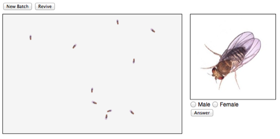
All three 'labs' had the same underlying idea in that there was a small window with several fruit flies running around which the students were able to 'anaesthetise', so they stopped moving, and which they could then examine by clicking to get an enlarged image (see figure below). The students then answered questions associated with that particular section of the lab, such as the sex of the fruit fly, the type of mutation (if any), and determining the inheritance patterns for different crosses of fruit fly mutants.

Screen Shot 2012 02 23 at 07 24 02
Virtually sexing fruit flies

The above image is of the fruit fly 'sexing' lab. Unfortunately, I cannot show you the animated version of the lab as I am unable to add the necessary Javascript to this page to get the flies to move.

Screen Shot 2012 02 23 at 07 22 46'Anaesthetised' flies

The student has 'anaesthetised' the flies in the above image, so they are no longer moving. Then, the student clicks on a fly to get an enlarged view. The student can then answer the question as to the sex of the fly.

Two final problems - one mine, one HTML5

Coding up the lab was pretty straightforward, and after some initial fiddling and debugging of the code, everything was working. However, there were still two problems.

The first problem was that the virtual labs would only work in 2011 on the latest versions of the browsers for Internet Explorer, Safari, and Chrome and would not work at all in Firefox. This was a real shock, as I expected any problems associated with Internet Explorer. (It turned out that the lab would not work in Firefox because Firefox had yet to implement one of the key animation calls used to control the animation.)

The other problem was purely down to my code. The virtual labs rely on several 'random' number generators and some trigonometry functions to control the movement of the flies. Somewhere in the code, I have something wrong because if I leave a lab running for an extended period, all the flies end up in the bottom right-hand corner of the screen. Although this does not detract from the lab experience, it is annoying!

Why do my flies end up in the bottom right-hand corner?

Summary

The lab was designed to run in a 3-hour slot, with the students exploring the virtual fly labs for the first two hours and completing several other tasks, including answering several formative questions, with the last hour used to start the online summative assessment. I was surprised that the students managed to work through the lab section in about 90 minutes. However, those who rushed the lab did find the summative assessment more difficult. I have run the lab with over 1000 students in the past 3 years, and this is a recurring theme, even when they are warned not to rush.

The lab worked well, and there were no apparent problems or complaints during the day. The final marks for the online summative assessment were in line with other modules and other work completed by the students, so overall, I think the lab was a success and met the learning outcomes for the session. In the feedback I have had from students taking the labs, I have had no complaints.

One problem that I have encountered is that the site requires significant maintenance. The code base needs changing every year as the HTML5 standard continues to evolve, and the support offered by the different browsers continues to evolve.

If you would like to support my blogging efforts, then please feel free to buy me a coffee at https://www.buymeacoffee.com/drnickm

(* Gamification is using game-like ideas and strategies to help students learn; that is, the students learn while having fun and playing a game. Learning by stealth.)